

The post
I was going through Instagram and came across a post from a guy I follow. He’s 58. He wasn’t talking about work or politics that day. He was talking about funerals.
At his age he’s started losing people. Friends, not distant acquaintances — the kind of loss that makes a man do arithmetic he’s been avoiding. So he did something most people never do. He went and looked up the average life expectancy.
The number came back 70.
He said it out loud on camera. Twelve years.Fifty-eight behind him, twelve in front. You could see it land on him. He talked about faith, about spending less time on everything that isn’t family, about getting out and walking. He’s carrying weight. He said the word walking like it was the last exit before the bridge.
I sat with that number for a while. Then I went and looked it up myself.
He was wrong. Not a little wrong — wrong in two separate ways, and the second one is the reason I’m writing this.
Where 70 comes from
Type “average life expectancy” into a search bar or an AI and you can get almost anything back. Global figures, decade-old figures, figures for a different country. Seventy is roughly the globalnumber, and it’s dragged down by places with high infant mortality and limited healthcare.
For an American, the current figure is 79.0 years — 76.5 for men, 81.4 for women. (CDC/NCHS, 2024 final data)
That’s nine years he handed away by not checking which number he’d been given. But that’s the small error.
The column nobody reads
Here’s the part almost nobody knows, and it changes everything about how you should think about your own timeline.
“Life expectancy” as most people hear it means life expectancy at birth. It’s the average age at death for a baby born today. It is not the number of years you personally have left.
Life tables have a second column. Actuaries call it e(x) — the years remaining for someone who has already reached a given age. And that number climbs as you get older, because every year you survive, you clear all the ways people died before you. The dead don’t keep dragging your average down once you’ve outlived them.
From the Social Security Administration’s period table, for men: (SSA period life table, 2023)
| If you’ve reached | Years remaining | Which puts you at |
|---|---|---|
| 50 | 29.9 | ~80 |
| 56 | 24.9 | ~81 |
| 58 | 23.3 | ~81 |
| 65 | 18.1 | ~83 |
| 75 | 11.4 | ~86 |
| 85 | 6.0 | ~91 |
Read the last row again. A man who makes it to 85 is still averaging six more years. The finish line keeps moving away from you for your entire life. That’s not motivational-poster talk — it’s what the table says, and it’s the single most misunderstood fact in this entire subject.
So he had it backwards
He said twelve years. At 58, the average is 23.
He’d buried himself a decade early. And if he makes it to 70 — the number that scared him — the table hands him another fourteen on top.
If you’re 70 reading this, you are not near the end of anything. You could have twenty years in front of you. If you’re 20 or 40, the arithmetic is even less about death and even more about what condition you arrive in.
Which brings me to the number he should have searched for instead.

The number he should have looked up
There is a twelve in this story. It just isn’t the one he found.
Researchers track two separate things: how long you live, and how long you live in good health. The distance between them has a name — the morbidity gap, sometimes called the healthspan-lifespan gap. It’s the stretch at the end where you’re alive and not well.
Globally that gap is about 10.7 years, up from 8.8 in 1990. The United States has the widest gap of any country measured: 14 years, roughly 17.8% of an expected lifespan. (Global Burden of Disease analysis, Lancet Public Health, 2026)
Earlier work using WHO data put the U.S. gap at 12.4 years and noted it was 29% larger than the global average. (JAMA Network Open analysis of 183 countries)
So the honest version of the man’s math isn’t twelve years and then it’s over. It’s twenty-three years, and on current averages the last fourteen of them are spent unwell.
That’s the number that should scare somebody. Not the date. The condition.
Why the rich countries look worst
Before anyone frames this as an American catastrophe, the ranking needs a second look.
The countries with the biggest gaps are the wealthy ones. High-income countries averaged a 12.7-year gap. Australia and Canada sit right behind the U.S. at 13.9 and 13.7. Nauru, the Solomon Islands and Laos posted the smallest gaps of any countries studied — not because people age gracefully there, but because shorter lifespans leave less time to accumulate unhealthy years. (morbidity gap analysis, 2026)
The U.S. figure also carries real uncertainty — the 95% range runs from 10.8 to 17.5 years.
Both things are true at once. Living longer mechanically produces more years of poor health, and the U.S. gap is wider than peer countries with similar lifespans. What you do with that is yours.
Fourteen years of what, exactly
“Poor health” is abstract until you know what’s in it.
Worldwide, the biggest drivers of unhealthy years are low back pain, depression and anxiety, and hearing loss. (GBD 2026) Not the diseases people fear most. The ones that quietly remove your ability to do things.
And the widening isn’t confined to the last few years of life — researchers found the gap expanding across the whole adult lifespan, meaning people are carrying disease and disability through their forties, fifties and sixties, not just their eighties. (Lancet Public Health, 2026)
Low back pain and lost independence are not a diagnosis you wait for. They’re a slow subtraction of what your body will still do. Which means they’re measurable, right now, at home.

The stopwatch that beats the blood test
In 2011, researchers pooled nine separate cohort studies — 34,485 adults aged 65 and up, followed between six and twenty-one years, 17,528 deaths — to test one question: how well does walking speed predict survival?
The answer embarrassed most of medicine.
At age 75, predicted ten-year survival across the range of walking speeds ran from 19% to 87% in men, and 35% to 91% in women. (Studenski et al., JAMA 2011)
Same age. Same sex. A spread of sixty-eight percentage points, produced by nothing more than how fast someone walked across a room.
Every 0.2 mph of additional speed came with a 12% lower risk of death. A pace around 1.8 mph sat at median life expectancy for most ages. Anything at or above 2.2 mph consistently outlived what age and sex alone predicted.
And the researchers noted something else: predicting survival from age, sex and walking speed was as accurate as predicting it from age, sex, chronic conditions, smoking history, blood pressure, body mass index and hospitalization history combined.
A stopwatch matched the whole chart.
That was 2011. A 2018 systematic review pulled 48 independent cohorts and 101,945 participants and landed on the same figure from the other direction — each 0.2 mph reduction in gait speed carried a 12% increase in mortality risk. (meta-analysis of 48 cohorts, JAMDA 2018)
It also holds in the very old. In a population study of 772 people averaging 89.6 years old — a third with dementia, over half dependent in daily activities — usual walking speed still independently predicted five-year mortality. (Umeå 85+/GERDA study)
Why would walking speed carry that much information? Because it isn’t one system. Getting across a room at a normal pace requires cardiovascular capacity, muscle mass, joint integrity, nerve conduction, balance, vision, and the absence of pain. Everything a checkbox questionnaire would ask you about is already showing up in your gait. Walking speed doesn’t compete with those measurements. It summarizes them.
How to actually measure it
This is the part you can do in the next ninety seconds.
Mark thirteen feet on the floor. From a standing start, walk it at your usual pace, the way you’d cross a parking lot. Not fast, not for a test. No encouragement, no pacing yourself. Time it. Divide 9 by your seconds.
That’s your number, in miles per hour. (protocol as used in the original research)
Rough landmarks from the pooled data: under 1.3 mph flagged elevated risk. Around 1.8 mph was median. 2.2 mph and above beat the prediction. 2.7 mph and above tracked with exceptional longevity.
The single most useful thing you can do with it is write it down with today’s date and do it again next year. The researchers who built this suggested exactly that — tracking it over time, where a decline signals a new problem worth looking into.
One number. No clinic. No appointment. It’s the first of the five tests in The Mark on the Wall, and it’s deliberately first because it’s the only one that needs nothing but a tape measure and a phone.

Two weeks
Here’s where this stops being about people in their eighties.
Researchers took ten healthy adults averaging 72 years old and asked them to cut their daily walking. Steps dropped about 76%, down to roughly 1,400 a day — the equivalent of a bad flu, a minor surgery, a stretch of rain, a knee that hurts.
Fourteen days. Not months.
In two weeks they lost 3.9% of their leg muscle. Postprandial insulin sensitivity fell 43%. Inflammatory markers rose — TNF-α up about 12%, CRP up about 25%. (Breen et al., J Clin Endocrinol Metab 2013)
For comparison, young men who cut their steps by an even larger margin lost about 2.7% over the same two weeks. (Krogh-Madsen, reported in this review) The older group lost roughly 25% more muscle from a smaller reduction in walking.
Two weeks off your feet costs a 70-year-old more than it costs a 30-year-old. That’s the whole engine of this article.
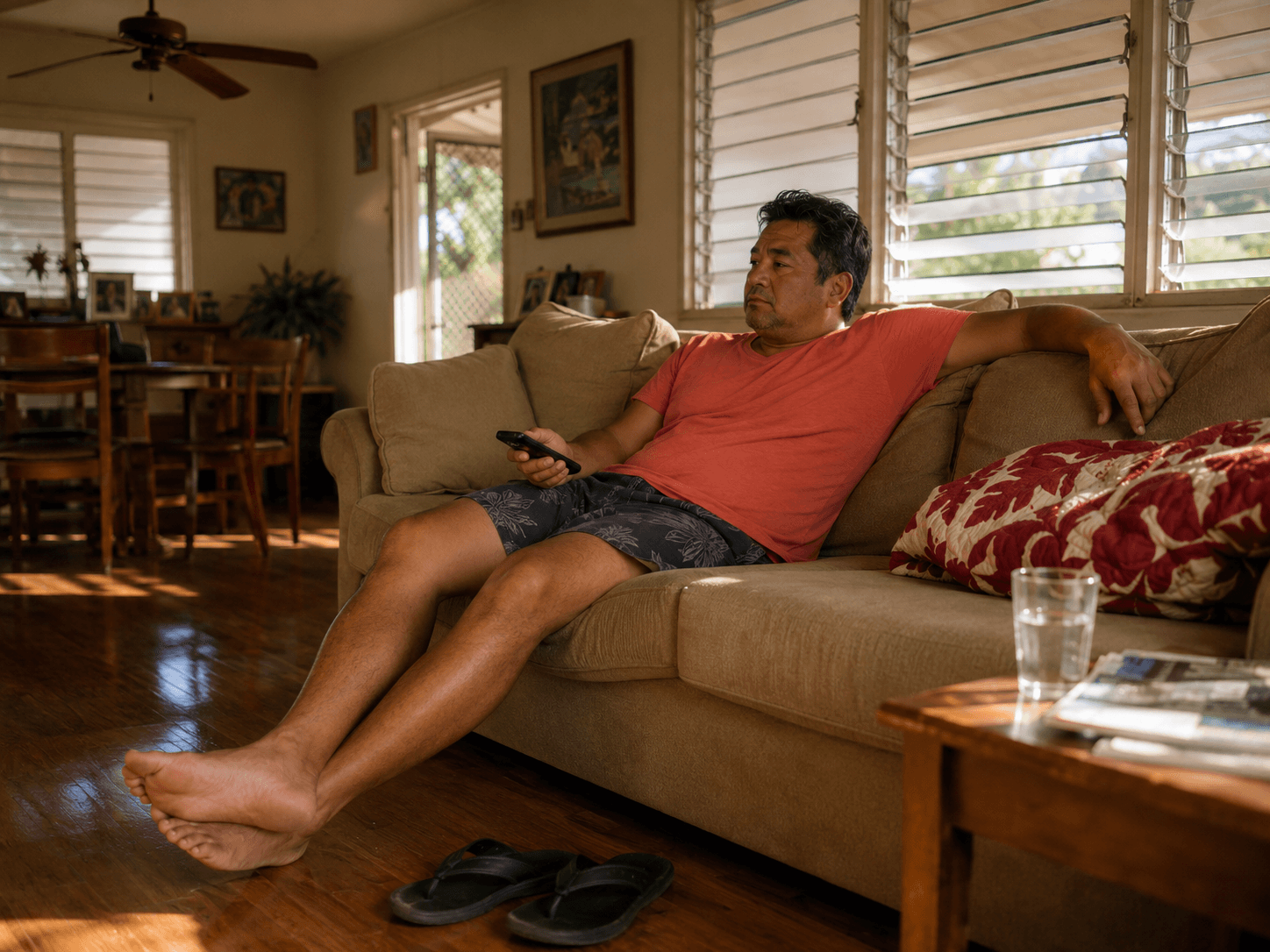
Anabolic resistance
The interesting part isn’t that muscle was lost. It’s why.
When you eat protein, your body normally responds by building muscle protein — a process called muscle protein synthesis. In the step-reduction group, that response to food dropped about 26%. (Breen et al., 2013) Resting rates didn’t change. What changed was the body’s ability to use a meal.
That’s anabolic resistance: the muscle stops answering when protein arrives. Across several trials from the same lab using step reductions between 750 and 1,500 steps a day, muscle protein synthesis came down 13–26% from baseline. (review of step-reduction trials, Frontiers in Nutrition 2019)
This is the mechanism nobody explains to ordinary people, and it reframes a lot of well-meaning advice. Someone who stops moving and eats moreprotein to compensate is pouring water into a container that has partially stopped absorbing. The protein isn’t wasted, but loading is what reopens the door.
The metabolic side
What showed up consistently across every step-reduction trial, regardless of how much muscle was or wasn’t lost, was the metabolic picture. Glucose regulation worsened in study after study, and in some cases it worsened before body composition changed at all.
The part that doesn’t come back
If you read one section, read this one.
Twenty-two overweight, prediabetic adults averaging 69 years old were tracked through three phases: a week of normal activity, two weeks cut to under 1,000 steps a day, then two weeks back to normal walking.
Their step counts confirm they did it — about 7,362 a day at baseline, 991 during the reduction, 7,117 in recovery. All the way back.
Insulin resistance rose during the inactive stretch. And during recovery, with steps fully restored, insulin sensitivity did not return to baseline. (McGlory et al., J Gerontol A 2018)
The authors’ own framing is the line that matters: unlike younger adults, this did not recover on a return to normal activity.
Younger bodies absorb two bad weeks. This group didn’t. Going back to what you were doing before was not enough to undo what two weeks did — and reversing it took more than the activity that had been sufficient to maintain it.
That asymmetry is what people are actually up against, and nobody tells them.

Why it accelerates
Now put the pieces in order, because they don’t act separately. Each one feeds the next.
Movement drops. Muscle protein synthesis falls, so muscle mass goes with it. Muscle is where most of your glucose gets disposed of, so glucose handling worsens. Inflammatory markers rise. Less muscle and more inflammation means less strength and more joint discomfort. A body that’s uncomfortable moving moves less. And now you’re back at the top of the loop with less to work with than last time.
Researchers describe this directly as a vicious cycle in aging muscle. (Inactivity and Skeletal Muscle Metabolism: A Vicious Cycle in Old Age) A separate review of reduced activity across young and older adults lays out the same metabolic and musculoskeletal chain. (Bowden Davies et al., 2019)
Two things make this compounding rather than merely additive. Each turn of the loop starts from a lower baseline. And each turn makes the next reduction in activity more likely, because discomfort is a powerful argument for sitting down.
There’s a longer-range version of the same arithmetic. In a four-country study following adults through ages 50 to 75, people with none of three behavior-related risk factors — smoking, physical inactivity, obesity — could expect about 8 more years in good health and 6 more years free of chronic disease than people with two or more. (multicohort study, England/Finland/France/Sweden)
Eight healthy years, in a twenty-five-year window, from three variables.
Sitting is its own exposure
A question worth separating out: if you exercise, does sitting the rest of the day still matter?
A harmonised meta-analysis of more than one million men and women found that high levels of moderate activity — about 60 to 75 minutes a day — appeared to eliminate the increased mortality risk associated with high sitting time. People in the top activity quartile who sat more than eight hours a day had lower mortality risk than people who sat under four hours in the least active quartile. (Ekelund et al., Lancet 2016)
Two things about that finding. First, 60–75 minutes a day is four to five times the standard public health recommendation — it’s a real ask, not a footnote. Second, the same analysis found that high activity attenuated but did not eliminate the risk associated with high TV-viewing time specifically, which suggests TV time is carrying something beyond just sitting.
Later work using accelerometers rather than self-report put the attenuating dose lower, around 30–40 minutes a day. (discussed here) A separate meta-analysis estimated 34% higher mortality risk for adults sitting 10 hours a day after accounting for physical activity. (Chau et al.)
What stops it
The first good news in this article, and it’s specific.
Researchers ran the same two-week step-reduction protocol on older men, but had them do low-load resistance exercise three times a week in one leg during the reduction. The trained leg lost 1.4% of muscle. The pattern of loss the protocol reliably produces was offset — and muscle protein synthesis was higher in the trained leg than the untrained one, both fasted and after eating. (Devries et al., Physiol Rep 2015)
Low load. Three times a week. During the inactive period, not after it.
The mechanism is worth understanding because it tells you what the exercise is actually doing. Resistance work doesn’t just add muscle — it restores the muscle’s sensitivityto protein. It reopens the door that inactivity closed. That’s why loading beats every nutritional intervention tested against it.
There’s a related finding from the bed rest literature worth knowing: in older adults on seven-day bed rest, a 2,000-steps-a-day intervention did not fully protect skeletal muscle health. (2019) Walking helps. Under some conditions, walking alone isn’t enough, and load is the missing variable.

Protein, honestly
Because every supplement site claims this section, here’s what the trials actually did.
In a randomized controlled trial, older adults went through a week of energy balance, a week of calorie restriction, then two weeks of calorie restriction plus step reduction under 750 steps a day, with protein supplementation tested against control. (Oikawa et al., Am J Clin Nutr 2018)
In the low-load resistance trial above, the exercise offset the losses. A citrulline supplement tested in the same study did not. (Devries et al., 2015)
A review of nutritional strategies against disuse atrophy states the position plainly: the most potent intervention to mitigate disuse-induced muscle deterioration is mechanical loading in the form of resistance exercise — and the review exists precisely because loading isn’t always feasible during illness or injury. (Nutrients 2020)
Protein matters. It is not a substitute for load, and the research reads as clearly on that as research ever reads.
The hospital problem
This is the section to remember on behalf of somebody older than you.
Hospitalization in older adults produces something with its own name — hospital-associated disability. Function is lost during the stay, often despite the admitting problem being successfully treated. (Creditor, “Hazards of hospitalization of the elderly”)
The mechanism isn’t mysterious. Observational work found older inpatients spend 83–95% of their hospital stay in bed, rarely walking or being mobilized. (MOBINT observational study) And when researchers separated the variables, the greater impact on functional dependency and cognitive decline came from days of bed rest, not total days of hospitalization. (2016)
It’s addressable. A structured in-hospital walking program was tested specifically to prevent hospital-associated functional decline. (WALK-FOR trial)
Read that against the two-week step-reduction findings and a week in a hospital bed at 70 stops looking like a week off.

The floor
Everything above converges on one question you can ask your own body, and it isn’t how fast you walk. It’s whether you can get down to the ground and back up.
That’s where decline shows first and where it’s felt hardest — sitting on the floor with your grandkids, getting in and out of bed, going down to reach something and having to plan the trip back up. Walking speed tells you the trajectory. The floor tells you what it’s already cost.
That has its own deep dive: Getting Up Off the Ground — what the research says about the sitting-rising test, what the movement actually requires, and how to build it back.

Where to check yourself
I’m not going to hand you a number of years. Nobody honest can. Somebody could do everything right and be ten days from a heart attack, and somebody could do everything wrong and see 90. What can be said is that function is measurable, it moves, and it responds to load.
Three lanes. Go down whichever one is yours.
Your function — start here, it’s free and it’s four minutes.
The Mark on the Wall — the five-test baseline. Walk speed, sit-to-stand, getting up off the ground, balance, and grip strength. Write the numbers down with the date. That’s the whole point: not a score, a starting line you can compare against next year.
Your behaviors.
Project Big Life — calculators built by public health scientists at the Ottawa Hospital Research Institute, modeling life expectancy from smoking, alcohol, diet and physical activity. Built on Canadian population data, so it’s a directional read for an American, not a precise one.
Your risk factors, if you have specific ones.
Smoking: in a German cohort of 22,469 adults, heavy smoking at age 40 was associated with 9.4 fewer years for men and 7.3 for women. (EPIC-Heidelberg)
Multiple habits together: a cohort of 46,620 adults scored eight lifestyle factors — fruit, fish, milk, walking or sport, BMI, smoking, alcohol, sleep. Men at 40 scoring 7–8 points averaged 46.8 more years; women 51.3. (2022)
Already diagnosed: this is the one I’d want somebody to see. Among 55-year-old men five years into a type 2 diabetes diagnosis, modeled remaining life expectancy ranged from 13.2 to 21.1 years — the low end a smoker at 180 systolic with an 8:1 cholesterol ratio and 10% HbA1c, the high end a non-smoker at 120 systolic, 4:1, and 6%. (life expectancy tables for type 2 diabetes)
Eight years of difference inside the same diagnosis, from things that can be changed. Nobody has to cure anything to get years back.
The man in that post got the number wrong and got the instinct right. He said walking.He wasn’t reasoning from life tables — he landed on the one variable that carries more information than any of the rest.
Twenty-three years, not twelve. And the question isn’t how many of them there are. It’s how many of them you’ll still be able to get up off the floor.
Go measure something. Write the date next to it.